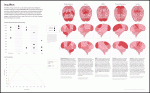
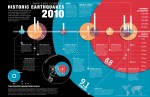
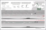
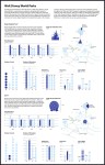
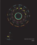
Visual references of the Richter scale illustrate the orders-of-magnitude differences in the amount of seismic energy released in a number of historic quakes. Paul Scudieri, 2010.
Visualizing Data / Information / Processes
Information Design | Course: Studio | Students: 12 | The Ohio State University
Design 340, 673, 5055. 2010-2016.
Undergraduate and Graduate Students from a wide variety of majors—including Design, Policy, Law, Computer Science, and Cognitive Systems Engineering—are tasked with creating effective strategies for visually communicating complicated processes, systems, or data sets as simply and clearly as possible. A synthesis of form and function, students combine a process of structuring and clarifying interdependencies with a sound approach to graphic design in order to reveal otherwise obscure narratives or to reveal hidden trends.
The commonality between science and art is in trying to see profoundly—to develop strategies of seeing and showing.” —Edward Tufte
The course begins with an overview of information design and data analytics through the writings of Edward Tufte (Envisioning Information), Alberto Cairo (The Functional Art: An Introduction to Information Graphics and Visualization) and an examination of online, interactive resources, including data graphics from the New York Times and the award-winning collaboration between the departments of Dance and the Advanced Computing Center for Art and Design at OSU with choreographer William Forsythe on Synchronous Objects. Class discussions and writing assignments encourage students to examine the subtleties of effective design, including typography, color, annotation, and the thoughtful integration of data and explanation, all while working within the limits of human cognition. Students are expected to collaborate with their classmates during studio sessions and formal reviews, often bringing considerable insight from their own educational backgrounds to others’ projects.
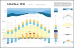
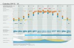
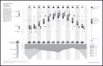
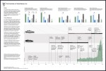
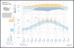
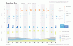
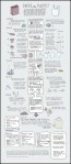
Student projects—some of which feature the thesis or dissertation work of graduate students—have included the creation of information graphics to explain the development of artificial attention algorithms in robotic visual systems; the seasonal trends revealed by plotting weather data in Columbus, Ohio; the time-and-location-based charting of casualties on the Eastern Front during WWII; and a historical overview of Apple’s iPod, allowing the viewer to compare differences in cost, size, price, and performance from model to model.
Required Texts:
Envisioning Information by Edward R. Tufte
Information Graphics by Sandra Rendgen
Recommended Texts:
The Visual Display of Quantitative Information by Edward R. Tufte
Visual Explanations: Images and Quantities, Evidence and Narrative by Edward R. Tufte
Beautiful Evidence by Edward R. Tufte
The Functional Art: An Introduction to Information Graphics and Visualization by Alberto Cairo
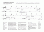
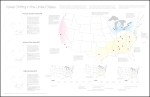
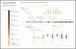
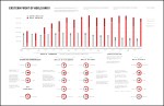
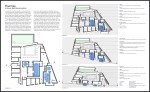
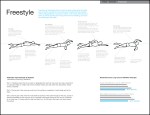
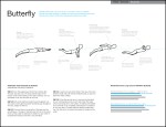
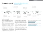
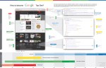
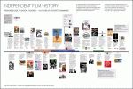
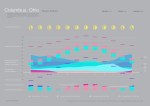
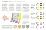
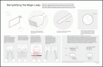
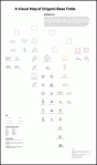
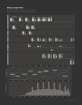
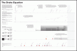
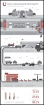
Below: student projects.