
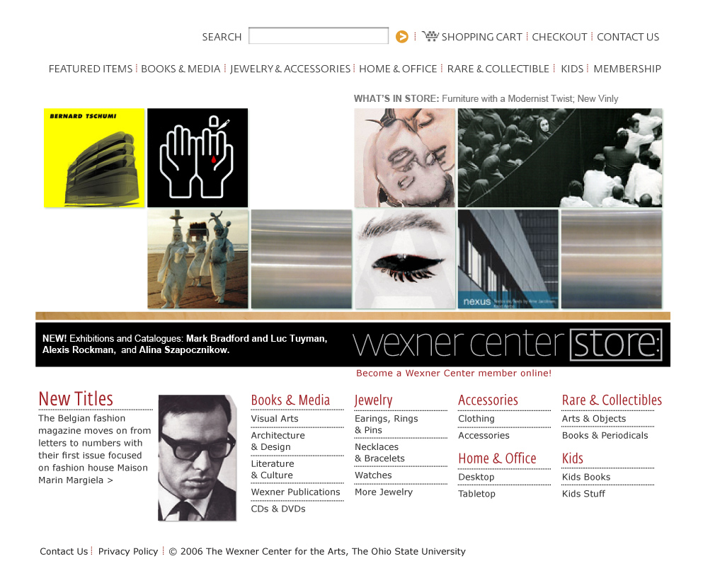
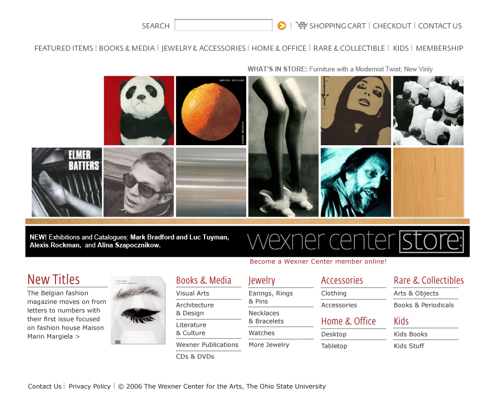
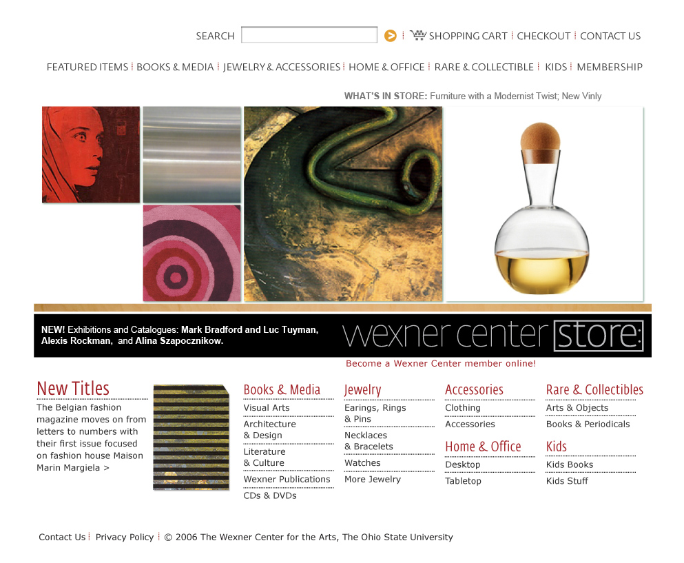
The Online Store makes direct allusions to the architecture of its real world counterpart: Colors, materials, and the ubiquitous grid.
Design, Meet Architecture
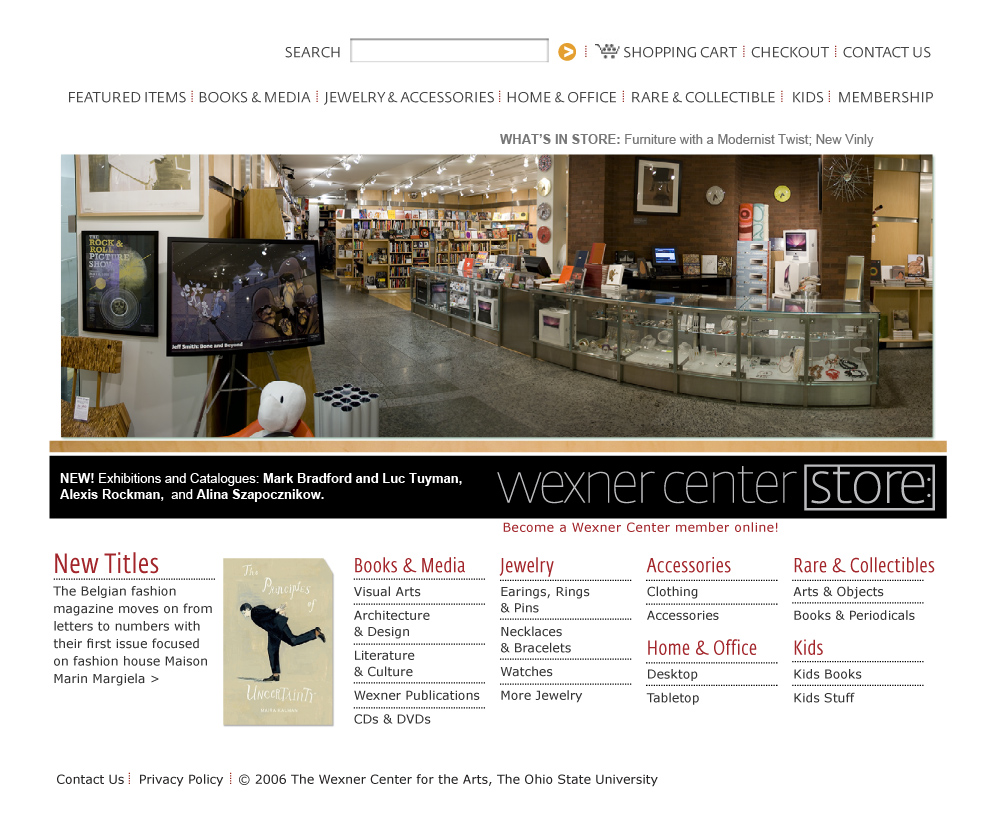
COLUMBUS—When architect Peter Eiseneman broke the rules with his Deconstructivist masterpiece, the Wexner Center for the Arts quickly made a name for itself as a cutting-edge contemporary arts center and as one of the country’s best places to shop for arts-related media and products. The Wexner Center Store stocks thousands of rare and hard-to-find titles, on topics ranging from film and video to painting, the performing arts, architecture, photography, and theory and criticism.
The visual design of the website makes allusions to the square module used in the brick-and-mortar store, including the custom glass showcases, shelving, and wooden panels lining the walls. There are additional references to building materials, including stainless steel, glass, oak, and black wooden laminates. The 6 × 2 grid is filled with graphics of products sold, and a designer can create new layouts by choosing from a variety of product shots provided by the publishers, making updating quick and easy.


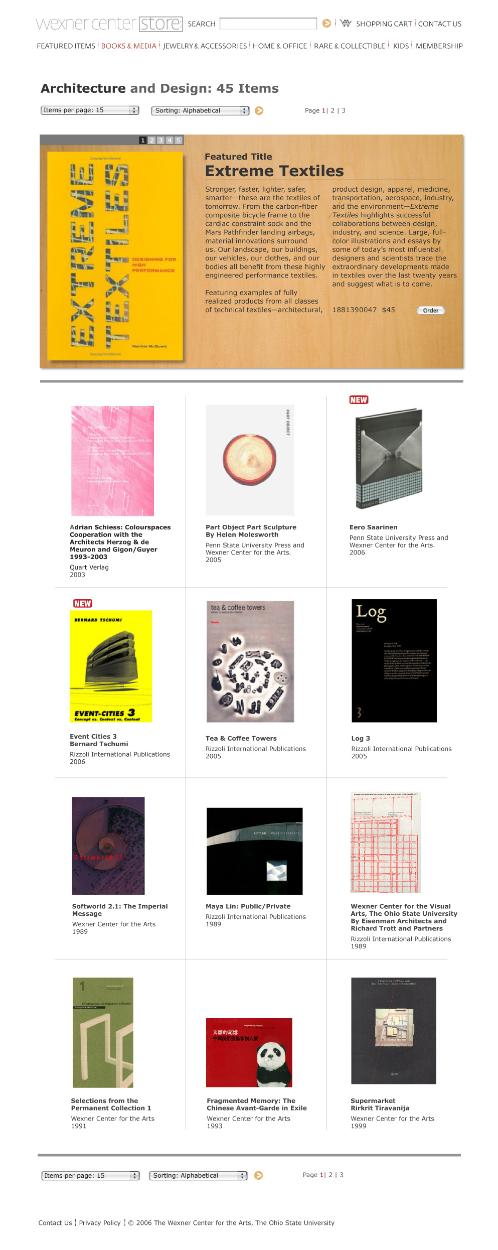
In the redesign, a focus was placed on creating a site with a simpler information architecture, more aesthetic user interface, and more conventional browsing and checkout features. Interior pages were organized to allow viewers a succinct view of available products, with full descriptions including title, publisher and publication date, all presented at sufficient size and resolution for easier viewing.
This version of the site was first published in 2006 and ran until its replacement in 2011.


You must be logged in to post a comment.